
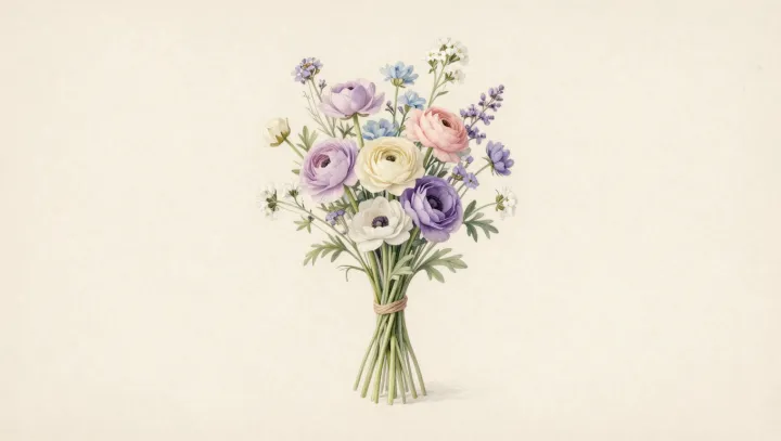
A pastel flower on a screen is not innocent decoration; it is a low-arousal visual environment built on physics and neurobiology. Muted pinks and powder blues carry lower chroma and softer luminance contrast, which means the visual cortex receives gentler gradients instead of abrupt jumps in wavelength and brightness. That quieter signal reduces the demand on edge-detection circuits and color-opponent pathways, the neural systems that constantly flag sharp borders and saturated shifts as potential threats.
The calming effect is not mystical, it is accounting. High-saturation hues generate stronger responses in the magnocellular and parvocellular pathways, driving more activity in regions linked to vigilance and orienting. Pastels, by compressing both saturation and contrast, effectively lower that metabolic budget, so the brain spends less glucose on parsing each petal and outline. When color science studies show that softer palettes reduce reports of visual fatigue and headaches, they are capturing this reduced processing load rather than some vague idea of charm.
Even the emotional warmth people feel toward pastel florals is partly structural. With fewer high-energy reds and electric blues triggering fight-or-flight associations, associative networks in the limbic system are free to link the image to safety cues such as skin tones, dusk light, or distant foliage. The result is a kind of visual exhale: the illustration does less, neurons fire less, and the viewer experiences that reduction as calm.